|
|
Post by thehush on May 14, 2006 23:23:46 GMT -5
Huzzah! This is the first time I've ever actually finished a piece. There are a lot of things wrong with it, but I wanted to share it anyway. I think I did a fairly good job varying the line weights, and my choices are fairly appropriate, for the most part. I missed a few spots, and will be fixing those, but over all I'm happy with it. Please, be honest. Don't just blow smoke. I want to learn so that when I work with an inker I can truly understand and appreciate the work being done. So, without further ado: The original, done by Andie Tong ( www.digitalwebbing.com/forums/showthread.php?t=89463&highlight=classic+x-men ): 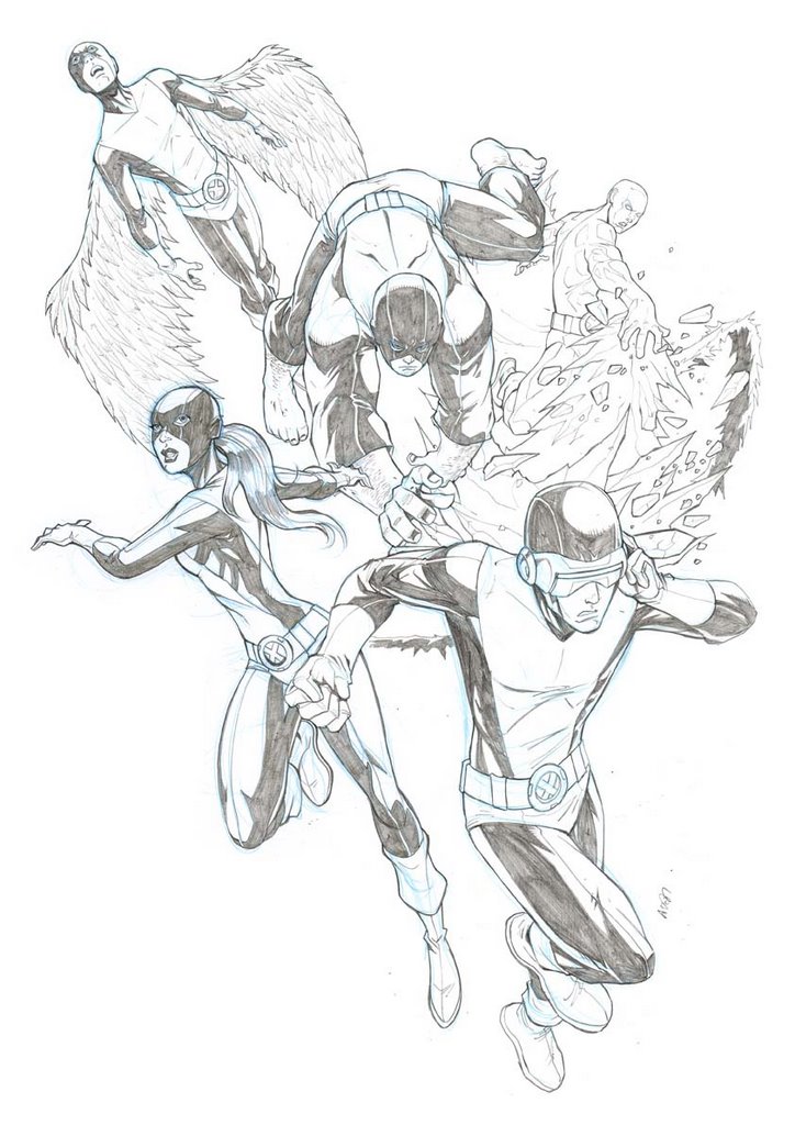 My inks:  |
|
|
|
Post by Jesse " Cadre" Hansen on May 15, 2006 8:48:48 GMT -5
Hey bub... glad to see ya post your inks finally... been awaiting them... OK, let's see... hmmmm... I can see some areas that the line weights vary, but not enough to make the impact this piece could have... for example, when an object is further away, the line weights would be thinner (newer style inks anyway) or perhaps closer to viewer would be a bit thicker, which ever way helps best and easier to understand. (same thing and all... just different way of saying it) case in point, if you look at back figures and notice that they seem to have the same line weights as the front figures... The textures seem to be there though... a hard thing for some to pull off. The rule of line variations also play in with a single figure without any other figures around... the closest objects would have a thicker line weight than those further away. Let's take ol' one eye for example: The front of his knee would be a bit thicker contour than the back of his leg along the hip due to proximity of it to the viewer... his head would have a thicker contour than his shoulders for the same reason, albeit slightly closer in value than the knee example since they are much closer in proximity than the forefront knee to hip scenario. I'd make the belt loops and lines around belt area a bit thinner as well... it stands out too much in the scheme of things. perhaps even have some fun with it... make a thin double line on top of belt to show it has thickness and a thick single line on bottom which could show it has volume as well as casts it's own shadow. A lot of inkers these days don't use shadows enough to create depth IMHO.  Pencillers don't always show all the depth that a figure or panel can use to it's advantage... that's where WE come in as inkers or my preferred title: embellisher. Ya know... you've inspired me with this piece... I think I'll ink the Cyke in this piece and show ya how I would approach it myself... albeit a quickie ink, but hopefully would get my point across. Keep it coming... very nice start and great control on the line weights as a whole... just vary some and think in part as a depth situation as well as volume...  Hope this helps some... Huzzah! This is the first time I've ever actually finished a piece. There are a lot of things wrong with it, but I wanted to share it anyway. I think I did a fairly good job varying the line weights, and my choices are fairly appropriate, for the most part. I missed a few spots, and will be fixing those, but over all I'm happy with it. Please, be honest. Don't just blow smoke. I want to learn so that when I work with an inker I can truly understand and appreciate the work being done. So, without further ado: The original, done by Andie Tong ( www.digitalwebbing.com/forums/showthread.php?t=89463&highlight=classic+x-men ): My inks: |
|
|
|
Post by thehush on May 16, 2006 8:14:42 GMT -5
Hey thanks Jesse! Great crit, and VERY helpful.
I'm going to try all that out, in addition to what else I have been told (or not been told, as it may be). I hope to have a decent redux of this soon.
|
|


